Blog 10: How to Buy A Stock

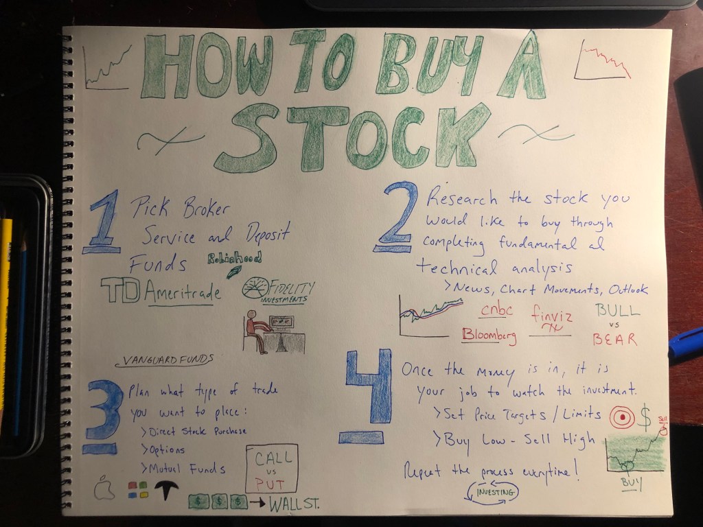
For this blog assignment, I decided to draw out something that I think can be useful to everyone. I drew out the process of buying a stock. The reason why I did this is because no matter what, you will not be able to enjoy life and retirement if you only have one source of income. With buying a stock, you are owning a share of a company that should, hopefully, gain in value overtime. The audience I was going for was someone of a mature age, and who can understand some rather complex things. I showed this to my friend who has no investing experience, and they were confident that they could buy a stock by looking at this.
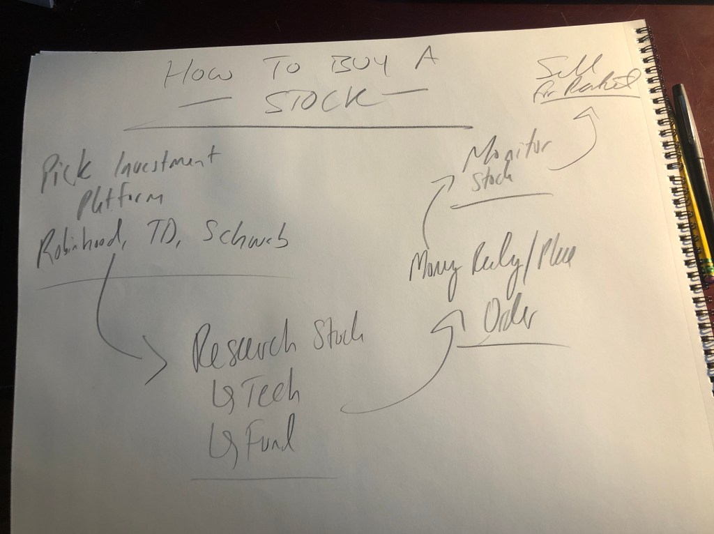
My design process was nothing special. I simply took the most important information that I use when investing and dumbed it down. Things get confusing when you overcomplicate things, and because this thing involves people’s money, I knew that it had to be simple. Investing also doesn’t involve much art so I knew that the wording I chose needed to be short a sweet. The pictures I drew I believe show my reader the key points to look out for. This would tie into my aHa moment because I wasn’t too sure on how to draw out the investing steps. I knew that by drawing diagrams that represent buying low and selling high would resonate with my readers. If I had more time, I would focus on my drawings to better show the investing steps. But I am confident that people can use this and invest successfully.

Blog 9: Captain Toilet Paper

For this blog, I decided to design an action hero that essentially is the savior of toilet paper. Enter Captain Toilet Paper, the dynamic hero that swoops in to beat up any shopper that thinks it is a good idea to load up on more than they actually need. With all that is going on in the world right now, I knew that I wanted to somehow work the problem were facing into the blog. I chose to center on toilet paper because we hear stories of older people not being able to get what they need because of crazy shoppers who are basically hoarders. I knew my age group of 9-12 so I included bright colors and easy to follow dialogue.

When thinking about Captain TP, I was wondering how I could show it best. I knew that I wanted to include a toilet and other essential bathroom items. His helmet/mask is a giant roll of toilet paper while his body is a toilet that shoots water. He also carries around a plunger and a bottle of Febreze to fight off greedy shoppers. Sticking with the vigilante-super hero theme, when Captain TP is not fighting crime, he is living the life of an eccentric billionaire.

I’m not sure why the picture loaded in this way, but in it you can sort of see my thought process. In the comic strip, I wanted to focus on Captain TP stopping a greedy shopper and to stress the importance of sharing items in your community with others. Because this is based for kids, I knew that if I could have included an underlying message with my toy, it not only would increase sales, but teach kids what the right thing to do is. I would say that as soon as I realized this, which was my aHA moment, the blog basically made itself.

Blog 8: Storyboard

My story is a rather simple one. I took the idea of two people waiting for a bus and instead of the bus being a typical one, it is a cool bus that jumps through a ring of fire. I didn’t get any inspiration from Nancy, so I went my own way. I knew that I couldn’t use text, so I figured the easiest way to show the transition would be red arrows. I also knew that by having a max of 6 frames (me going with 5), I chose to illustrate things certain ways.

In the second box, I attempted to draw one of the people getting on the bus in a hurry. Throughout the story, you can see little lines coming off the bus, implying that the bus is moving at a quick rate of speed to make it over the ring of fire. To me, this is a quick and simple storyboard to follow. Nothing complicated, and very funny to watch come together.

For the most part, my storyboard stayed the same the entire time. The only thing I added in was arrows to help guide the readers. I also felt that by outlining everything, I would be sure to capture my reader by making everything so detailed. For instance, without the small lines coming off the bus, you wouldn’t be able to tell it was moving quick. I also tried to move the clouds in each as to show the change in location.

In regard to the Nancy page, it was not loading for me so I wasn’t able to copy or paste any of them into my blog. I think after looking at it, this came together very nicely, everything came out how I wanted it to, and I think it is my best one yet.

BLOG: How to Make a Mug Cake

The Final Product

When I first began this project, I was very mindful of my target audience; a bunch of seven year olds who don’t speak that much English. That being said, I wanted to incorporate bright colors and “childish” images to better grab the attention of my viewers. For my research, I simply typed in “mug cake recipes” on Google and clicked on the first recipe, which had all of three very simple steps. Of course, I chose to break them down even further.

When it came to my research about Nigel Holmes, like the recipe search, I went to Google and typed in “nigel holmes wordless diagrams.” I chose to look only at his illustrations, or diagrams, so that I could get the basic idea of what to draw. Unlike him however, I think I came into issues with size of what I was trying to draw as well as coherence of following the arrows. I attempted to solve them by adding in numbers as well as outlining what the important things you needed to use were.

Work in Progress

My AHA moment came when I was beginning to draw it out. I liked how it was coming along but wasn’t too happy with the size of some of the ingredients. I knew that my outlining them, I would be able to guide my viewer in the right direction. I think in the end, in turned out for the best. If I had more time, I would demonstrate more in depth exactly how much of what you needed to put into the mug. The microwave was optional in this recipe, so I didn’t draw instructions for it, which I’m sure could confuse my reader.

I showed this to my parents, who both said that it looks like something a third grader would draw. That told me that my diagram turned out exactly how I wanted it to because I was trying to reach that target audience. I also connected some of the things I learned from class to my diagram, primarily with the arrows.

Blog: Walking Map

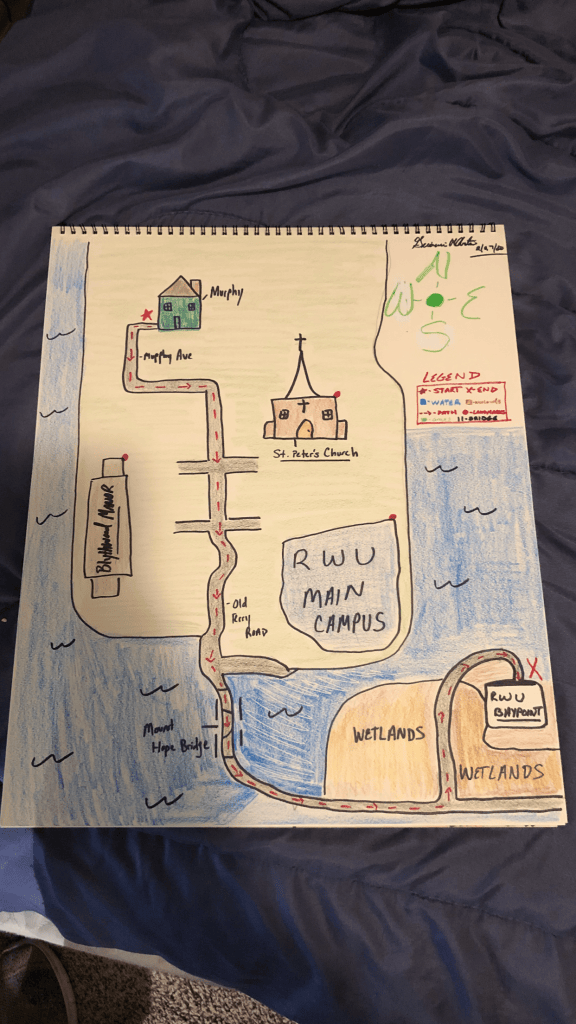
When I began thinking up my map, I decided to draw a map of how I would get to Baypoint from my off campus house. I chose Baypoint because it is a fun drive and they serve great lunch there.

Drawing a map in a sketchbook can be very hard. I wasn’t sure if I was properly drawing things, but after looking at the path from Google Maps, I found that I was pretty close. I chose these landmarks and roads because for the most part, it is a straight line and you only go on really two different roads. I was able to reduce uncertainty within my map by clearly drawing out key landmarks, such as a Manor, the campus, and the Mt. Hope Bridge. This way, people would be able to identify if they were going the right way based off of landmarks.

I really didn’t encounter that many issues once I knew what I was going for, and for my AHA moment, I knew I had produced a good map once I outlined the area. Visually imagining the area from above, I was able to pinpoint exact locations on the route that would make my map more clear.

If I had more time and resources, I would add in more landmarks and roads to better assist travelers who use my map. However, I showed my housemates my map and they had no issues following it. They said that the map would be useful for them if they had no idea where they were going.

Blog: Thumbnail Sketches

When I began this project, I was trying to achieve the most simple and straight forward designs as possible. After all, its luggage tags and they’re suppose to be simple. Looking at my designs, I would say that I achieved that goal.

I focused in on the particular shape because it is one that means a lot to me. I have been going to Block Island since I can remember and it really has become a part of me. I figured that it would be the perfect design for a luggage tag. Compared to the other ones, it has a very unique shape to it and for the color, I chose green because it really is a place surrounded by nature, almost like an escape from the real world.

When creating my thumbnail sketches, I found myself drawing a lot of tags with pointed edges in them. For some reason, I find those shapes to be the most appealing. To me, they come off as strong shapes, ones that you really would look twice at.

In regards to problems, I would say the biggest one would be creating 36 thumbnails, all which must be different. I found myself looking at the page for a while until I realized that I just have to let the pen flow loosely. Once I began doing this, I found myself cruising along.

My AHA moment was when I finished. I was very happy to be done with it and realized that I had created a good piece of work. If I had more time or resources, I would have made more unique designs. The biggest connection I drew from this is that designing things is very hard and tedious.

Blog 5: Photos

Structure

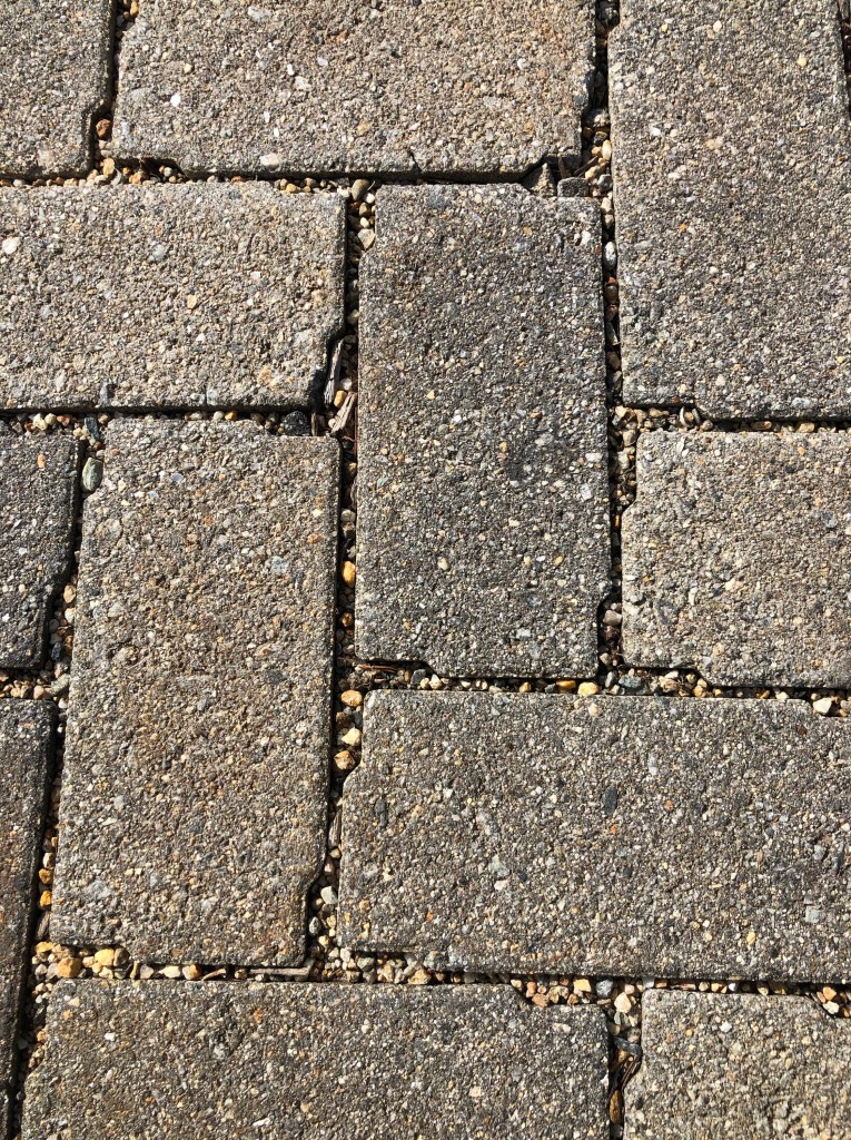
When looking at the photo illustrating the sensory principle Structure, we can see many different things if we look closely. For instance, looking the blocks, we can see that each one is made up of smaller pebbles, and concrete, and surrounding them are more pebbles to lay out the structure of the path. When all these things come together, it is hard to notice the small details unless you truly get close and examine it with the human eye.

Relative Size

Looking at the photo demonstrating Relative Size, again there is a lot to examine. Looking at the rock and concrete pillars, we are able to see just how big they are compared to all the smaller rocks surrounding them. Of course, the one that is closest to the camera looks to be taller than the other but in reality, they are the same size. The two pillars’ true size is put on display if you take a look at the bridge in the background. Obviously, the bridge is the biggest thing in the picture, but the pillars certainly seem to be larger than they truly are.

Shape

Shape was one that I really wasn’t sure how to capture. After all, everything in this world has a shape behind it but I really wanted to have a contrasting shape that would draw the eye right to it. Luckily, I came across a seashell on top of a bunch of rocks. When looking at the shell, there’s almost a triangular shape to it, but of course we know the shape to be that of a shell. My eyes are most drawn to the shell because of how may different details there are on it.

Color

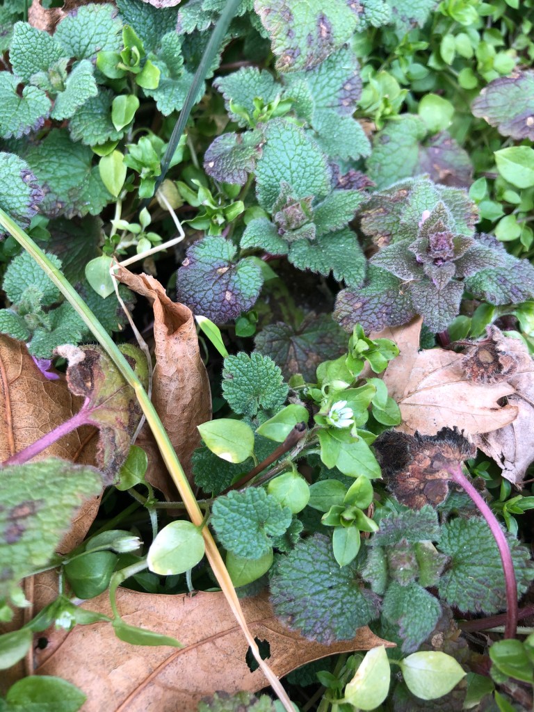
When looking at color, which isn’t easy to find this time of year, our eyes tend to go to the brightest and most vibrant one. In this picture, my eyes went straight to little white flower within all this crap. It isn’t the biggest of even brightest but for some reason, I am drawn right to it. I also like how the color purple is making its way all over the place, and that there are multiple shades of green to be seen.

Line

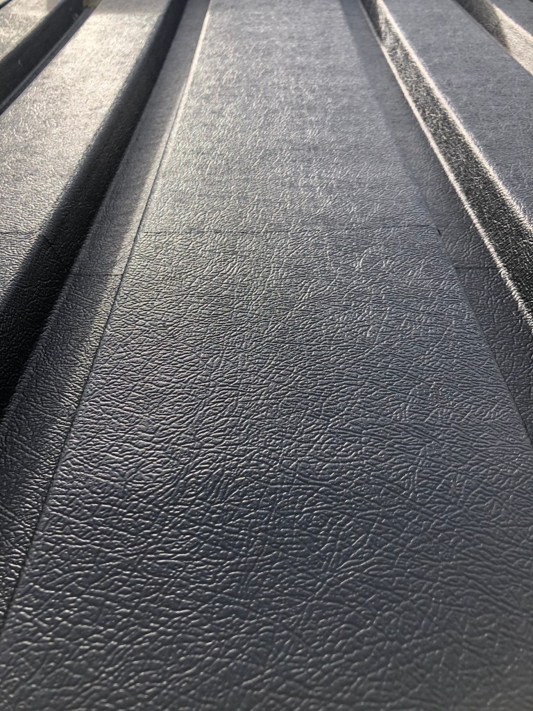
Finally we come to lines and with this photo, there are many to be seen. While there are bigger and more pronounced lines, the smaller, curvy lines I find to be most appealing. From a distance, you would never be able to see them which is why I found this to be very cool. But, it being a dumpster lid, there really isn’t much more I can say.

While doing this assignment, I was trying to achieve one goal: take the most simple pictures that would fit all the criteria. Art, and photography, doesn’t need to be overly complicated, and often times, things like color and shape are found in the simplest of things. Reflecting on it, I think that is was a good assignment and frankly am very happy with my work.

Blog 2: MindMap

Summer Living: The Final Product

I decided to map out where I wanted to live over the summer because there are many different places and things that I can do. While I am originally from Connecticut, I have a rental house in Rhode Island, a vacation house in Block Island, and family in New York. In all four locations, I have various things to do such as work, school, or leisure activities. I knew by mapping out my choices, it would allow me to get a better perspective on what would best suite me.

Summer Living: Work in Progress

While working on it, I really had no idea how to effectively use up the space while getting my message across. I then realized that I could include outlines of the states as well as things that I can do in all of them. For instance, in New York, I’d be working with money so I drew a dollar sign, (not to mention how expensive it is as well!) Similarly, in Block Island, I do a lot of fishing and moped riding so I knew those would fit nicely into the map. My AHA moment came when I began to think about the things that I not only enjoyed doing, but also that were important to me. This also made it easier for me to make up my mind on where I should live during the summer.

Connecticut Living: The Final Product

When it came time to break down one of my choices even further, I again thought about what was important to me. As I get older, I realize more and more that the day I move out is coming and that being said, I also realized that my summers with my family are almost over. Because of that, I knew that spending my summer in Connecticut was the best choice for me all around.

Connecticut Living: Work in Progress

When I started to draw out this map, I really had to think about what there was fun to do in Connecticut. It came easily to me when I thought about that many of things I enjoy to do know, I learned from my family. I knew that being home would allow me to fish more with my dad, golf with him and my grandpa, and party with my friends. Being back in Connecticut will also allow me to catch up on sleep, which will be much needed especially after finals. Being home would give me the time to do the things I enjoy without having to worry about spending money and running around.

If I had more time, I would focus on the drawings more. I think that I could have elaborated more on my choices but at the end of the day, I am happy with the choices I made. Reflecting on this, I think that is is useful but personally, I would also use a method that was easier and quicker to finish.

Blog Work 1: New York’s Captain

When I began to think of an idea to create for my first blog, I immediately thought of my idol and someone who I grew up watching, who coincidentally was just voted into the Baseball Hall of Hame. That person is Derek Jeter and the picture I chose to draw was the one of him taken during his last game at Yankee Stadium right after he hit the game- winning drive in run. I also knew that by drawing someone as respectable as Jeter, it would act as a salute to him. As far as inspiration, I have always been pretty terrible at drawing out people and it is something that I would like to get better at as time goes on. I also remember the days that I used to play baseball, and since I played short stop like Derek Jeter, knew if I had to draw a person, it would be him.

An interesting feature about my drawing is the facial expression I attempted to give him. In the real picture, you can see how happy and proud he was; not only was he ending the perfect career, but he was ending it with a game-winning hit.

Image result for derek jeter final hit"

The message that I wanted to convey to my audience was that if you put in the time and effort for something, people will end up respecting that. When Jeter retired, you saw fans from all across the baseball world come and salute the captain, something that you don’t see that often in baseball, or in any sport for that matter.

If I had more time, and patience, I would definitely have focused on the fans cheering behind him. I really wasn’t sure of how to properly draw them and instead of ruining the drawing, and taking the focus away from Jeter, I decided to just draw some circles to represent heads. I also attempted to draw everything in the picture, as well as add some of my own touches to it. When I showed my friend, she was very impressed by my artistic ability and noticed that he seemed happy, which is what I was going for.

Design a site like this with WordPress.com
Get started